Can you picture Ford’s blue oval or Mercedes’ three-pointed star? These are some of the most recognizable logos in the world, thanks to a number of reasons.
For starters, automakers are some of the world’s biggest advertisers. In 2020, the automotive industry spent $33 billion on advertising in the U.S. alone.
Automakers also maintain a strong physical presence by placing their logo on every car they produce. This form of self-promotion is an automotive tradition, and because of it, car logos are designed to be eye-catching and memorable.
To learn more, Visual Capitalist’s Marcus Lu and Zack Aboulam have illustrated the histories of six brands of interest.
Editor’s note: There are obviously many automotive brands with strong histories, but for this visualization we selected brands that we thought had the most interesting stories and graphical decisions behind their emblems. In the future, we may add more or create a follow-up post if readers express interest.
A Closer Look at Car Logos
Automakers often pack hidden meanings and details into their logos.
For example, Mazda’s current logo, introduced in 1997 and updated in 2015, depicts a pair of wings that represent the brand’s desire to “drive powerful, continuous growth.” The concept of flight is believed to embody the company’s pursuit of ongoing improvement. Of course, the wings also resemble a capital “M” for Mazda, similar to Honda’s “H” logo.
An interesting design choice of the Mazda lettering is that all of the letters except “D” are in lowercase. This was done because Mazda wanted to express precision, and a lower case “d” would have protruded above the upper line of the other letters.
Another logo with deeper meaning is Mercedes-Benz’s 3-pointed star, adopted in 1909. This symbol was based off a postcard that Paul and Adolf Daimler, sons of the company founder, got from their father in which the location of their home was marked by a 3-pointed star.
Today, the three points are believed to represent the strength of Mercedes’ engines across land, sea, and air.
Going Minimal
Over the past decade, many brands have taken their logos in a more minimalist direction. Many recently redesigned car logos are devoid of any 3D effects or color.
Audi is one of the most prominent examples of this trend. In 2016, it removed the chrome effect on its “four rings” and opted for a flat black version instead. This clean and modern emblem is better suited for digital media and appears more bold. Furthermore, the name “Audi” is no longer included at the bottom—a statement of the four rings’ strength.
BMW took a similar approach with its logo in 2020, stripping away the black outer ring and 3D effect. This minimalist and transparent logo is for “brand communication” only, meaning the logos on its cars will remain unchanged.
Finally, there’s Cadillac, which unveiled its own minimalist logo in 2021. This logo is being used to represent the brand’s full-electric future, and features a monochromatic version of the classic Cadillac Crest.
An Opportunity to Reinvent
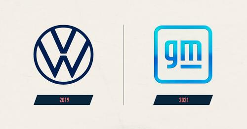
The race for EV dominance has provided automakers with the chance to update or reinvent their brands. In addition to the companies mentioned previously, Volkswagen and General Motors (GM) have also rolled out recent updates.
You may have already noticed Volkswagen’s new branding, which was updated in 2019. On trend with the rest of the industry, the company now uses a 2D logo which offers “outstanding flexibility in digital media”.
More importantly, the company’s branding is intended to feel much more colorful and natural, symbolizing a fresh start from Volkswagen’s 2015 diesel-gate scandal.
Shortly after, GM revealed a new logo as part of a campaign to promote its future electric vehicles. Unlike its minimalist competitors, GM’s new logo features a gradient of light blues that evokes “the clean skies of a zero-emissions future”.

